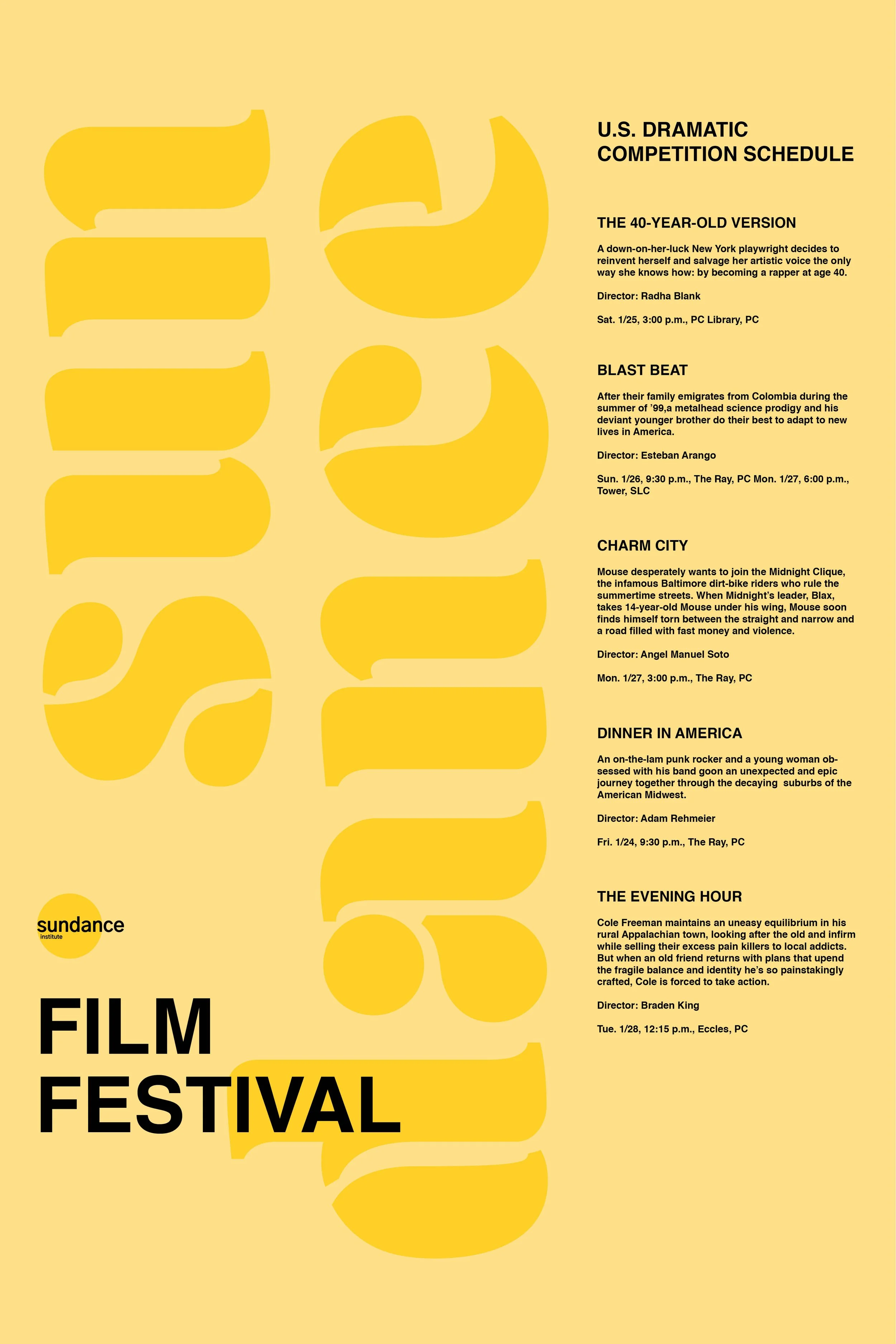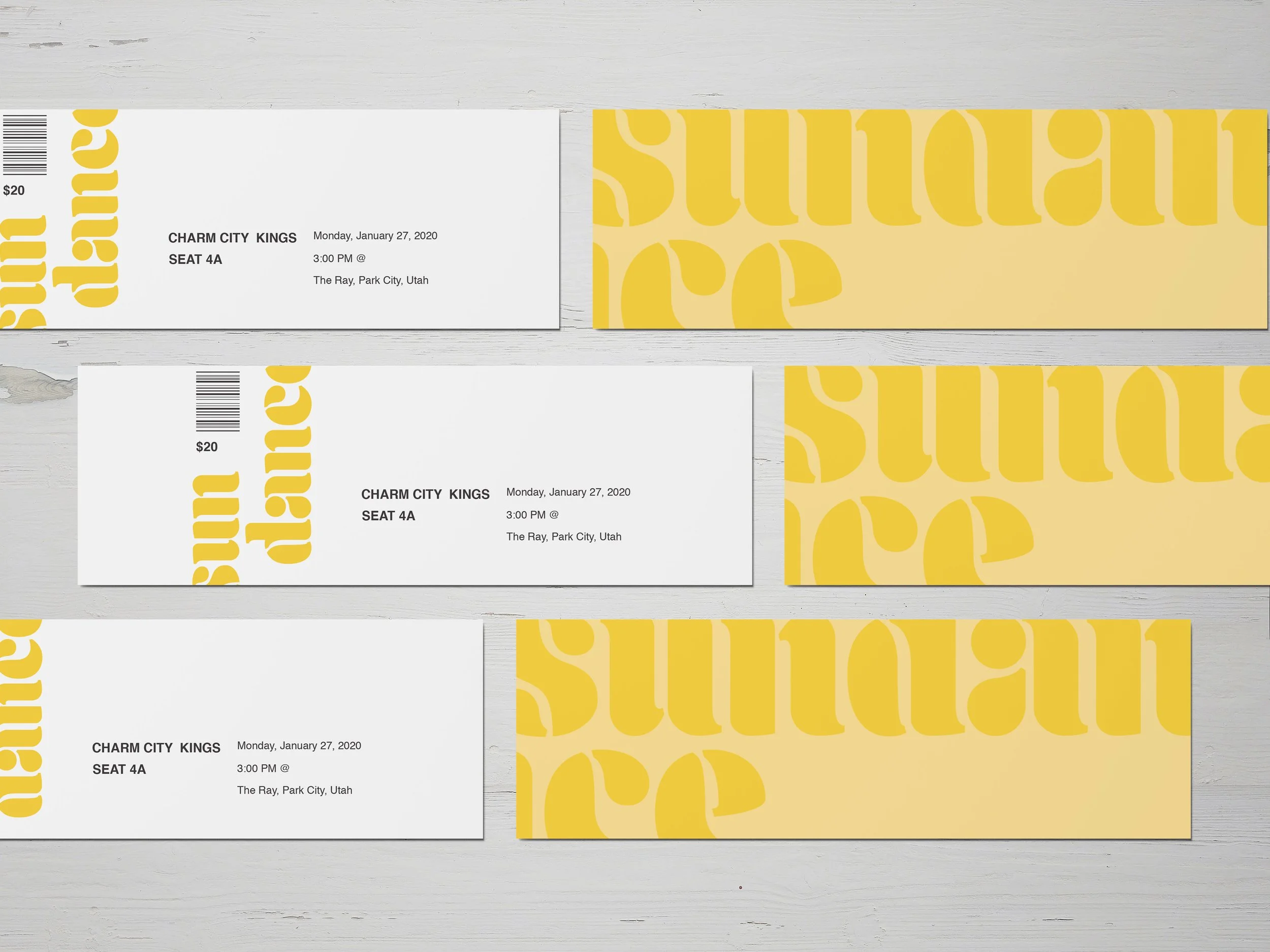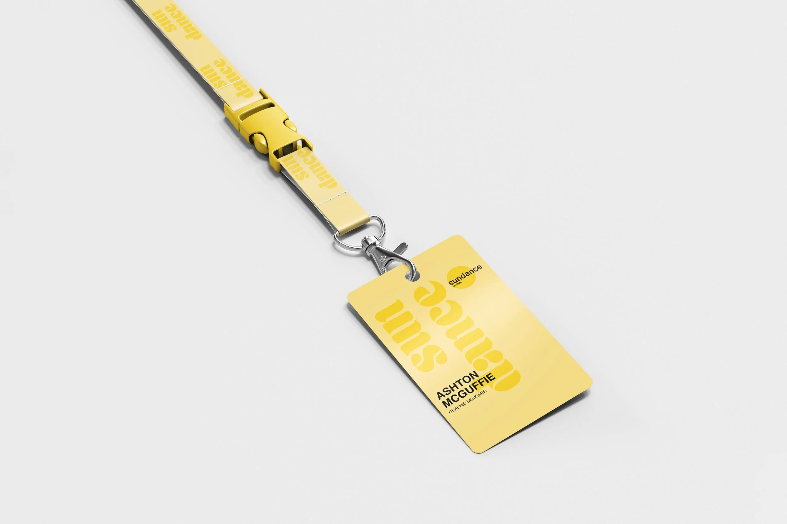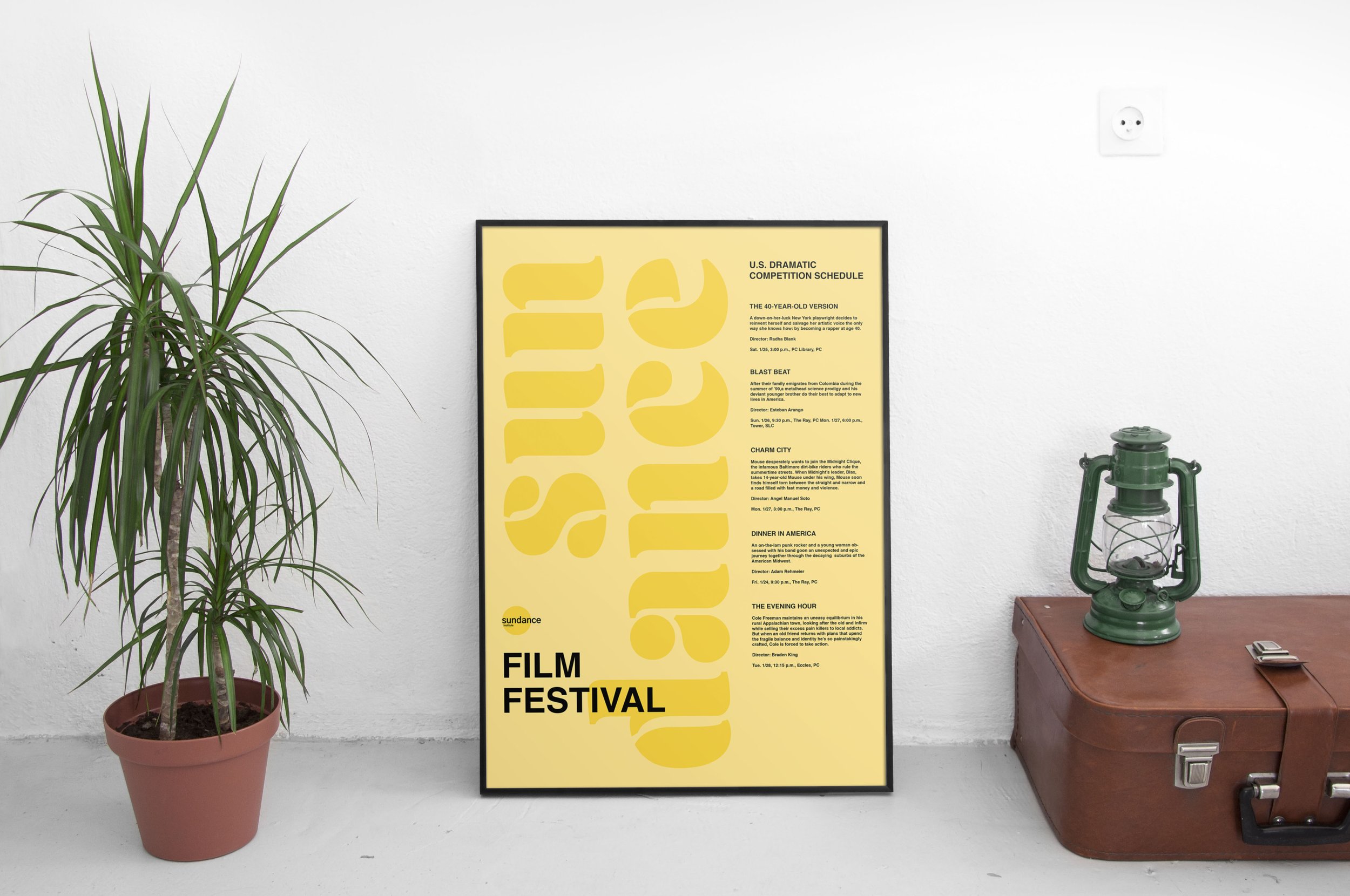
Sundance Film Festival
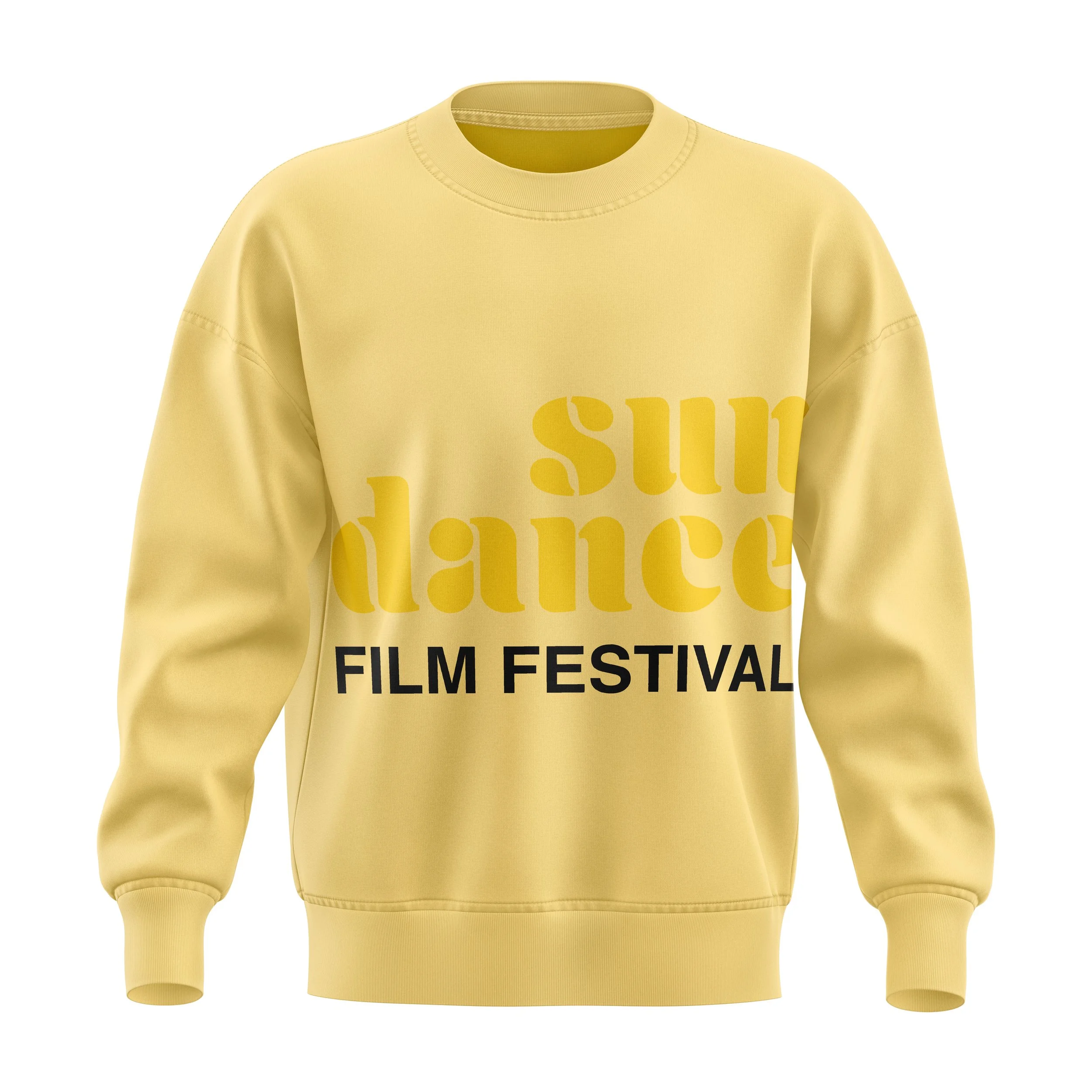
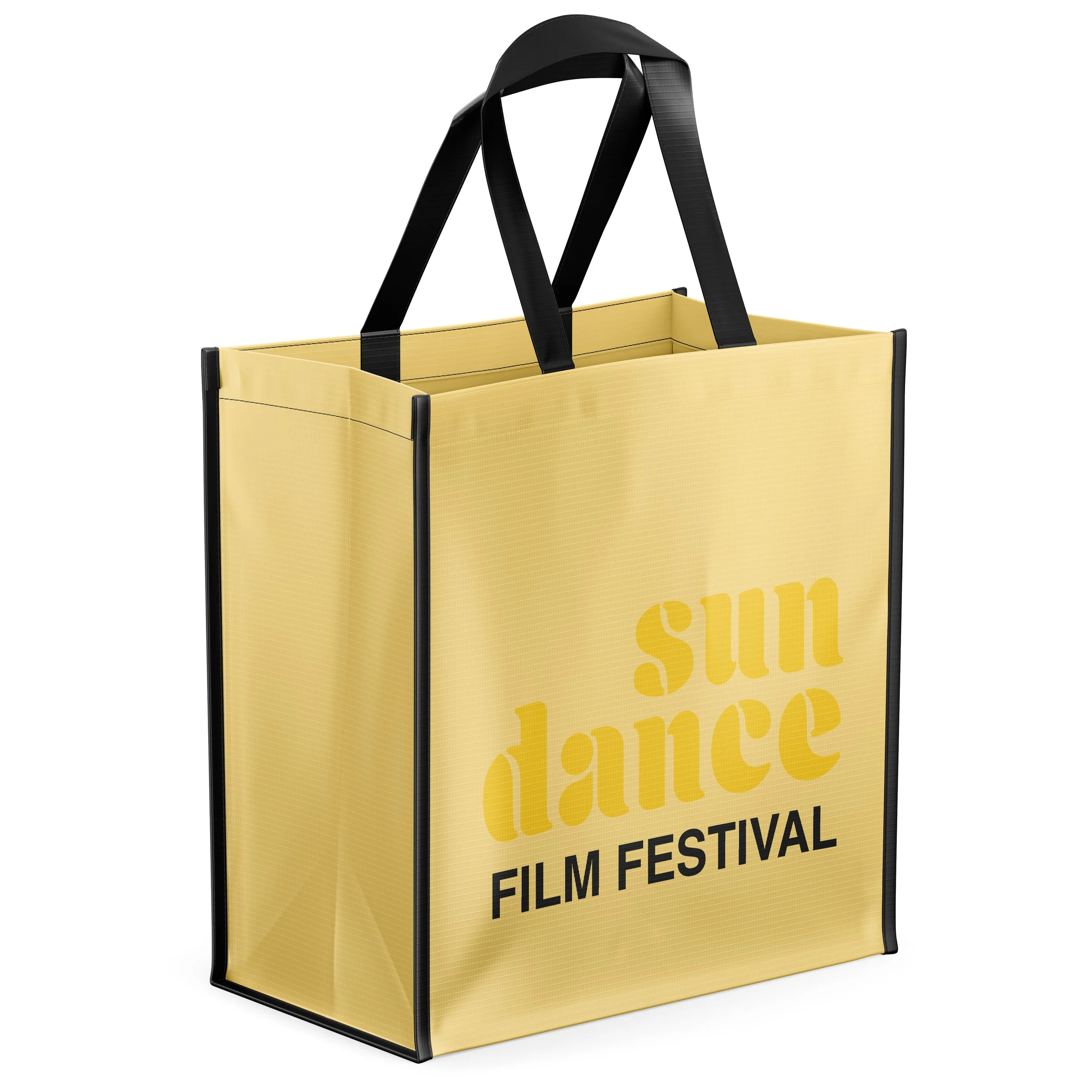
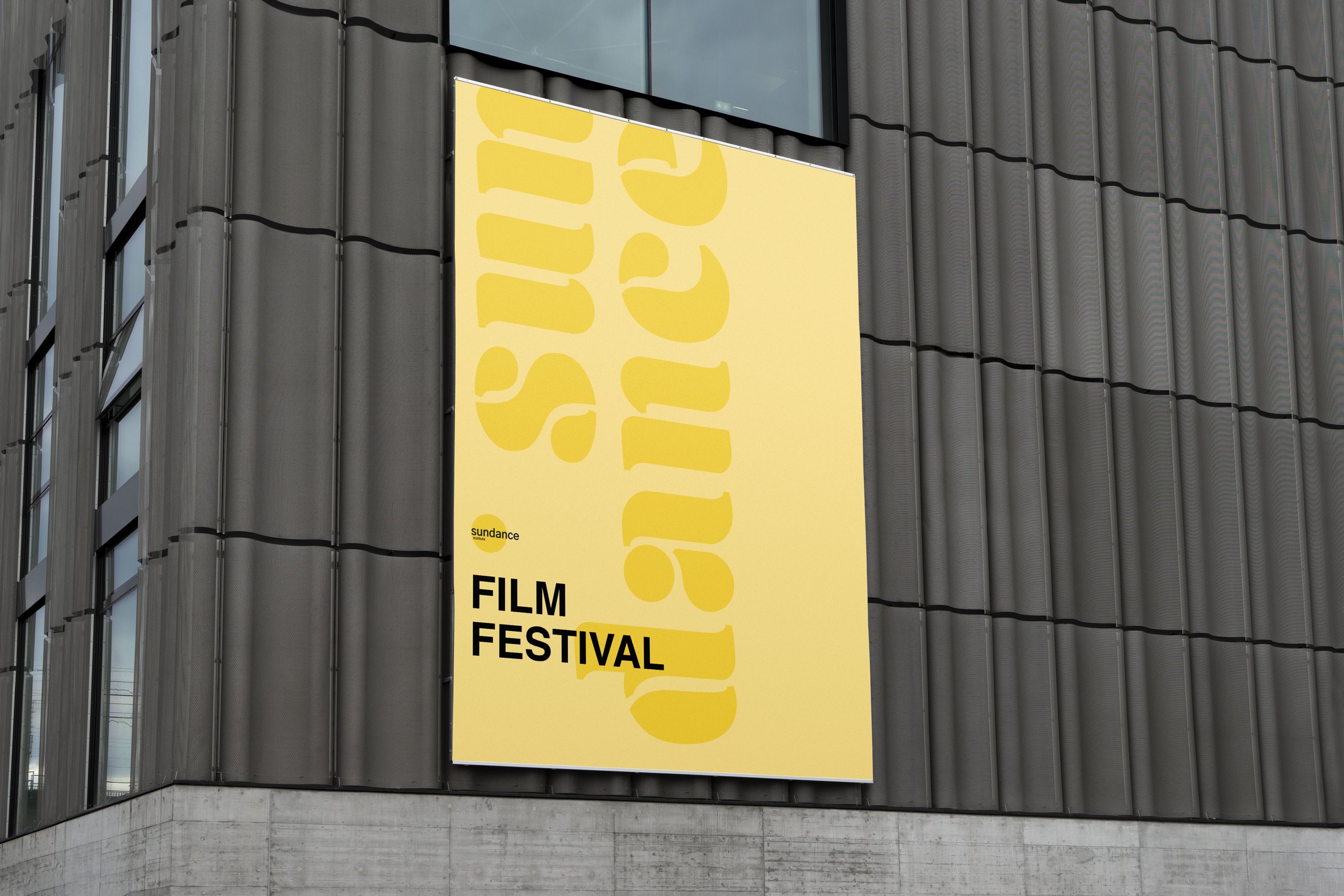
This project is a rework of the Sundance Film Festival branding. I wanted this identity system to be type-driven, rather than image-driven, because it is a festival of many different films. I chose yellow as the main colorway, because it visually connects with the sun in Sundance, and fits with the company’s logo. I used the typefaces Aromatron and Helvetica for a clean look, paired with the Sundance logotype.